Reimagine foundations
A WW design system

My role: Designer focusing on product and Visual design.
Tasks: Visual design, product vision, interaction design, prototyping, and close partnership with engineers.
Collaborators: Two senior designers and four engineers
Tools used: Pencil & paper, Figma, Jira, After effects
Platforms: web & IOS
😎
Overview
Throughout this Journey, we’ll explore how WW’s design system came to be, how it has evolved over the years, and how it’s been formalized into the fully supported product it is today.

Background
Reimagine foundations are built on CMS, built on reusable chunks of content known as slices. In addition, we wanted to introduce a design language that utilized white space and delightful motion.
Tip: Go ahead and get started. Don’t let perfection be the enemy of sound, and don’t let having an entire system be the enemy of having a few suitable reusable components. In the beginning, accepting that you won’t initially have everything can often be the most significant barrier to starting.

What is Reimagine Foundations?
Reimagine Foundations is WW’s design kit and reusable component library. This library is critical to sustainably scaling our products from a technical and end-user perspective.
We put our heads down and started documenting the value we knew Anatomy was providing. From understanding adoption to building a future roadmap, we put together everything we thought we’d need to show the value Anatomy was providing and could provide in the future.
Workflow

PROBLEM STATEMENT
Designers need help with the scalability of tokens, identity, and accountability.
WW designers weren’t aware of the brand identity, resulting in designing without purpose.
A sense of accountability for the design system was needed, which could lead to a systematic approach to component creation.
The brand needed a new design language incorporating white space and introducing delightful motion.
🤔
Why is it a problem
Inefficiency
It became challenging for designers to create components repeatedly, which slowed down their workflow.
Scalability
The design system has components that weren’t scalable, making designing across the product challenging.
Hierarchy
Designers used to take advantage of the design system by not following the rules, as there needed to be design guidelines in place.
Design gatherings
As WW evolved and gained complexity, the need for a consolidated design system was recognized.

❌ Inefficiencies in development work
❌ Discrepancies between visual design among products
❌ Lack of clarity on the brand for new team members
Pre reimagine foundations

Post reimagine foundations

Tip: Show, don’t tell. Design systems, for the uninitiated, may sound like a lot of work and not valuable. Understanding where you’re at is half the battle, and thoughtful road mapping will take you a long way when beginning conversations about staffing a team.
Why do we need it
WW’s value is user-centered. So for that, to understand their need to have a design system and how it would help the need for a design system.

UI Consistency
A consistent set of guidelines helps increase usability, eliminates confusion, and evokes an emotional response.
Responsiveness
Access to appropriately adapted content on any device dramatically improves the user experience.
Scalability
A design system collects reusable components, which can be extended to any team or application.
PATH FORWARD
How might we define, document, and scale our Guest Site Design System in Figma?
For the tracking experience, I tried to break down the scope of the solution into 'how might we statements:
Component audit

I did a component audit to find and consider all the design tokens we use in all WW products across the globe to ensure we are consistent with our guidelines and eliminate what isn’t being used anymore. This also helped identify other potential use cases.
Design iterations
The design system underwent many iterations before we had a shippable design candidate.


It was essential to consider accessibility and usability when designing the components. Since the component would be used globally, we had to ensure that the documentation and build would support all languages. I also created documentation that developers and designers could refer to, including the exact sizing of the component, label alignment, and variations.
Throughout the design system, we reference components such as global, structural, content, data, and utility. It was critical to define the differences between component classes so that design decisions are efficient and accurate based on the page's context.


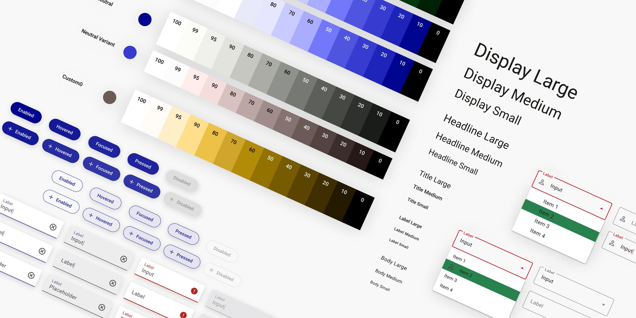

The file also contains a page for the component, a UI element that is easily repeatable throughout the design system.

The sandbox page enables a designer or developer to experiment with different ways of creating the component.


Accessibility
Any design system is only helpful if it's accessible. While that perspective is typically user-focused, it was two-fold. We wanted to ensure that we brought all the internal teams along the journey by providing a clear rationale, documentation, and education on the UX team's efforts to create an accessible system.

Input Feedback
Following one of our design system values of transparency, we aimed to ensure that our interface feedback, whether error or warning states, provided valuable information for our users. We devoid the system of confusing language, making it clear what to expect from any given interaction state.

Content Accessibility
Working with our content writers and brand teams, we developed strategies for parsing all images and videos so that we could begin to provide alternative text, captions, and audio descriptions.
User testing
We went through rounds of testing sessions with our designers, where they were tasked to break the design system by using the updated components in their workflow.
Feedback
After conducting various user testing sessions with the designers, I synthesized the results into critical findings.

Organizing
A consistent set of guidelines helps increase usability, eliminates confusion, and evokes an emotional response.
Lack of Identity
The visual identity of any organization can have an impact on the use of style guides. However, a design system should be welcoming and laid out with a strong foundation.
Ensuring UI consistency
I created an easily accessible stylistic guideline in Figma, which the user can refer to create seamless, consistent designs.
📈Results

WW designers loved my Design system so much that they ended up tweeting about it 🥰
70% of the designers adopted the design system for their workflow, increasing their efficiency!
Optimized scalability and reduced design time by more than 50% by redesigning 100+ components in the WW CMS system
🪞Reflection:
Design systems are evergreen. They are living systems that require a dedicated team actively involved in their growth and maintenance.
Accessibility is MVP. Defining accessibility requirements and getting buy-in at all levels of the organization from the beginning will directly impact those complex feature and enhancement conversations later down the line.
Global needs require global collaboration. With the help of our international partners, our blind spots quickly came into view. Considerations around culture and language must continue to be an opportunity in our work.